Composite Indicator Visualization
Construction of a new national ICT index by the Center of Internet Research in the University of Haifa, challenged us to seek for a practical and satisfying visualization solution for a Composite Indicator (CI). A CI is a measurement and benchmarking tool used to reflect and measure multi-dimensional concepts such as Information and Communication Technology (ICT) usage, individual’s well-being and more. Indicators are selected and combined to reflect the phenomena being measured. Measurement iterations produce a series of time-oriented data, which stakeholders as well as the general public might be interested to interpret. Visualization of a CI is highly recommended in order to ease interpretation. Yet there is a lack in guidelines for designing effective and engaging CIs visualization.
Out of the various ways to visualize CIs, radial visualizations are a common way of representing the multidimensionality of the indicators. However it is unclear how to visualize the temporal dynamics in radial diagrams. In order to make a step towards filling this gap, we conducted two controlled experiments using formal task taxonomy adjusted to CI tasks on a real world dataset. In the first experiment, the popular Radar chart was compared to two other radial visualization methods: Flower-charts as used in the well-known OECD Better Life Index, and Circle-charts which could be adopted for this purpose. Results indicate that Radar chart was the least effective and least liked, while performance of the two other options were mixed and dependent on the task. In second experiment, we compared static vs. dynamic time mapping using Radar and Flower charts. Results indicate that static time encoding was more effective than dynamic encoding. Still, an in depth analysis showed that the dynamic approach is a feasible and sometimes even better solution for important CIs tasks, leveraged by the fact that users seem to like and enjoy it. Radar charts were found to be less effective than the Flower chart independently on the time mapping, supporting results found in first experiment. Implementation of CIs visualization design guidelines can be seen in the recent Israel ICT Index:
The research is done as part of the National Israel ICT project by The Center of Internet Research supported by the Israel Internet Association-ISOC-IL; Bezeq; Appleseeds Academy; LINKS Learning in a Networked Society.
Collaborators
Joel Lanir
Sheizaf Rafaeli
Peter Bak, IBM Research
Publications
Yael Albo, Joel Lanir, Sheizaf Rafaeli (2017). A Conceptual Framework for Visualizing Composite Indicators. Social indicators research Link
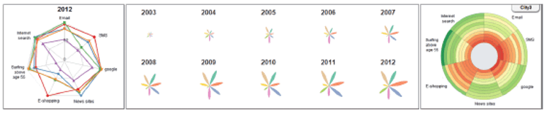
Yael Albo, Joel Lanir, Peter Bak, Sheizaf Rafaeli (2016). Static vs. Dynamic Time Mapping in Radial Composite Indicator Visualization. Proceedings of the International Working Conference on Advanced Visual Interfaces (AVI) pp. 264-271. Link
Yael Albo, Joel Lanir, Peter Bak, Sheizaf Rafaeli (2016). Off the radar: comparative evaluation of radial visualization solutions for composite indicators. IEEE Transactions on Visualization and Computer Graphics (ITVC). Vol 22, No. 1. IEEE. Download PDF
Yael Albo, Joel Lanir, Peter Bak and Sheizaf Refaeli (2014). Composite Indicators Visualization: Exploration of Multivariate Temporal Changes using Radial Visualization. The Eurographics conference on visualization. Download PDF
Date
2012